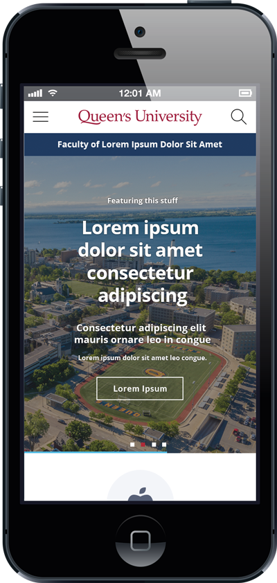
All Queen’s websites should be built and maintained with responsive design in mind. This means designing for the best and most consistent experience possible across operating systems, browsers, and screen sizes.
While you may be creating and editing on our desktop computer, it is important to remember that many of the website's users (indeed, more and more all the time) will be accessing your information on a mobile device, such as a tablet or a smart phone.
The term "mobile-first" simply means that design starts by considering content design and layout for mobile devices first, as they have the most limitations when it comes to rendering content, such as smaller screen sizes and potentially less bandwidth.
Breakpoints: Responsive design considers display breakpoints for page content, where the design adjusts (or "responds") according to the screen size of the user.
Testing: It is important to test how your page displays on a phones and tablets. Check out how your content stacks on smaller screens and ensure that the reading order of you page content is intact. There are browser tools that enable web developers to perform sophisticated testing, but to start, web editors can do some basic testing on various phones and tablets.