Queen's is obligated to ensure that all of our public websites are "WCAG 2.0 AA" compliant. This is the standard adopted by the Accessibility for Ontarians with Disabilities Act (AODA), and Queen’s reports regularly to provincial regulators on our overall compliance with such standards.
Content accessibility topics on this page:
- Images: text as graphic, alt text, caption text
- Links: accessible link text, styles, targets, lists, headings
- Colour: contrast and pairing
- Inline styles: use sparingly to maintain accessibility
- Video / Audio: captioning resources
- PDFs an other document formats: pitfalls of use on the web
- Tables: table headers
- Forms
Also on this site:
Across Queen's:
Queen's Accessibility Hub. Queen's is commitment to fostering a community that is inclusive for all individuals, and to ensuring that its services and spaces are accessible for persons with disabilities.
Faculty of Health Sciences Inclusive Style Guide. This I-EDIIA focused writing guide provides advice on how to engage with issues concerning race, gender, and sexual orientation, among other intersecting identities.
Elsewhere: See Ongoing Skills Development for more accessibility resources.
Accessible Images
Text as graphic
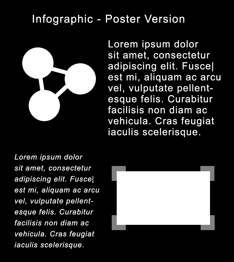
While images are an important part of any website, avoid using images with graphic text to exclusively relay important info.
Avoid the temptation of adding a poster, designed for printing, right into your website. When text or charts are added as graphics instead of HTML, anyone who can’t see the page will face a barrier to accessing that information. This applies, especially to those using a screen reader to read a page aloud.
Instead, complex infographics should be broken down into smaller images and recreated as much as possible HTML. They might not look exactly the same as a print design, but the information will be readable / accessible.


This is some sample text. This is some sample text. This is some sample text. This is some sample text.

This is some sample text. This is some sample text. This is some sample text. This is some sample text. This is some sample text. This is some sample text.
Alt text for images
"Alt text" an abbreviation of "alternative text" is the text that is rendered or read aloud when a user does not view an image.
Ensure that all images have alt text that describes what the image shows.
Within a source code view, the image tag looks something like this:
<img src="sam-smith-lecture.jpg" alt="[Sam Smith stands at a podium in front of classroom of students]">
Caption text
Caption text should also be included for images, wherever possible.
Alt text and caption text should be different.
Caption text should provide context for the inclusion of the image. For example, the caption for this same image might be "Professor Sam Smith welcomes the ABC100 class to Lecture Hall in September."
Links
Link text: descriptive and unique
Ensure all linked text is highly descriptive, strongly indicative of the topic that will be found on the linked page, and succinct.
Avoid "click here" in your link text. User experiences are varied and not everyone "clicks" with a mouse. Instead, users might tap, use voice activation, eye-tracking, or keyboard navigation.
Remember, also, that space and colour on a page are not experienced the same way by users. Don't reference a link somewhere else on the page, such as "select the red button" or "use the link to the right."
Ensure link text is unique on page; where the same link text is used, it should link to same URL.
Bad link text: Learn more
Bad link text: To learn more about the history of Queen’s University, click here
Bad link text: Click the red button to the right
Good link text: Learn more about the history of Queen’s University
Best link text: History of Queen's University
Link colour and style
- Reserve the use of blue text for links.
- Reserve the use of the underline style for links (i.e. don't underline any content that isn't a link!)
Article – Nielsen Norman Group: Guidelines for Visualizing Links
Link target: do not force a link to open in a new window
Ensure all links open in same window. Do not add the attribute target="_blank" to force the link to open a new browser window.
Use of target="_blank" can result in too many browser windows being open at once, causing clutter, confusion.
Also, when a link opens in a new window, the "back" button is not enabled, so once a user moves to this new page they cannot easily return to the previous page.
Remember that users experience web content in different ways. We do not want to prevent a user from controlling their own browser, keyboard, and mouse options and preferences. Users can already use a right click on the mouse to open a link in a new tab or window; you don't need to decide this for them.
Article – Nielsen Norman Group: Opening Links in New Browser Windows and Tabs
Lists of links
-
Write meaningful headings for lists of links: When grouping links together in navigation, avoid non-specific headings such as "Important links" or "Useful links" or "Quick links." Instead, find a heading title that provides context for the links.
-
Where you have more than 8 or 10 links, group the links under themes, or organize them chronologically or alphabetically. Where you have a very long list of links to offer, consider using accordion containers to keep your pages clean and easy to skim.
-
Indicate when you are linking to an external site: When linking your reader to a page off your site, it is sometimes helpful to let the reader to know that you are sending them off your site. i.e., "Learn more about xyz on the Queen's Gazette website"
No links in headings
Don't link a heading and then provide context for the link below that link. Instead, provide some introductory or "teaser" content to introduce a topic and then link the user to more information with meaningful link text
Betty's butter
Betty Botter bought some butter, but she said, "The butter’s bitter. If I put it in my batter, it will make my batter bitter.
Betty's butter
Betty Botter bought some butter, but she said, "The butter’s bitter.
Learn more about Betty's butter
Choosing colour
Ensure that information and tasks described on your site are not based on colour recognition, such as "click the red button."
Remember that users interact with web content in different ways:
- users of assistive technology, such as a screen reader, may have page content read aloud
- users with low vision may have trouble discerning text from background if the contrast is too low
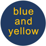
- users with colour blindness may not be able to discern the difference between specific colour, especially red/green and blue/yellow combinations
To bolster usability, a good design will see colour used in tandem with symbols and text, and specific information for assistive devices. With this approach, if the colour doesn't register meaning with the user, the symbol or text will.
Sticking to a simple colour palette is generally good practice.
Queen's visual identity colour guidelines provide a primary and secondary colour palette for Queen's websites
Colour contrast
Be sure to maintain adequate colour contrast between text and background.
There are many colour-contrast-checking tools and browser extensions available online.
Web Content Accessibility Guidelines – WCAG 2.0 AA – require the following:
-
Body text must maintain a contrast of at least 4.5:1
-
Large text/headings must maintain contrast ratio of at least 3:1

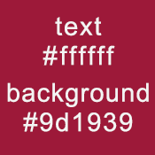
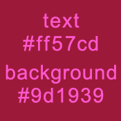
Pass – 8:1

Fail – 2.8:1
Colour pairings
Similarly, colour pairings can negatively impact users. About 5% of the population has some form of colour blindness, making it hard to differentiate between specific colour combinations, such as red and green used together, or blue and yellow.
There are colour blindness simulation tools and browser extensions available online that will show you how users may experience your design (see, for example, Who Can Use).
It can be tricky to account for every possible user issue, so colour pairings need to consider contrast as well.

Pass

Fail
Inline styles
Don't add in-line styles that limit browser and key commands. Instead, use the styles built into WebPublish, which allow the users’ browser preferences for colour, size and typeface to override our design. For example:
-
To allow for zooming in/out, base font sizes are set in relative units. When a reader uses a browser zoom function, the relative sizing of heading text compared to body text is maintained.
-
Some fonts are better for readers with dyslexia. Most websites suggest a family of fonts to display type, but these preferences can be changed by users in their browser settings.
-
While most readers prefer dark text on a light background, browser preferences can switch the display to show light text on a dark background.
Video / audio content and animations
Any video embedded in a Queen's webpage must include captions (closed or open) for users who cannot hear. Captions are also very important for users who choose to have sound turned off by default. A 2019 US study found that 92% view videos with the sound off on mobile. It also notes that 80% of consumers are more likely to watch an entire video when captions are available. The inclusion of descriptive text (for users who cannot see the screen) is also recommended.
Audio content should include access to a transcribed text file.
PDF and document downloads
For both accessibility and usability, critical site content should not be “locked away” in a pdf or other format that needs to be downloaded before viewing. Instead, include important information directly on the page.
This is especially important for mobile phone users and those without high speed internet service.
Where as case for including content in PDF format can be made (archived information, meeting minutes, etc), ensure it has been created with accessibility in mind.
Tables
When using tables in your site, ensure that they are only used to display tabular data, and not used to position text on the page.
When using a table, be sure to include <th> table header tags to first row, so that the data is properly labelled and easy for all users and access.
Where using a table, be sure that the table format is responsive – i.e. the layout responds to the smaller screen size and is viewable on a mobile device without having to scroll right or left to view.
Forms
If web forms are used, ensure that:
- instructions are presented before the form
- labels are named and placed in logical order
- labels are associated with the actual form field
- labels for radio buttons or check boxes are located to the right of the options
For information on how to make your web forms accessible, please see the Web Forms tutorial on the Accessibility Hub website.