Breakpoints
The grid system used for WP3 is slightly altered from the Bootstrap v3.4.1 grid. For more information on how to apply the system of containers, rows and columns to layout and align content, please see Bootstrap CSS for Grids
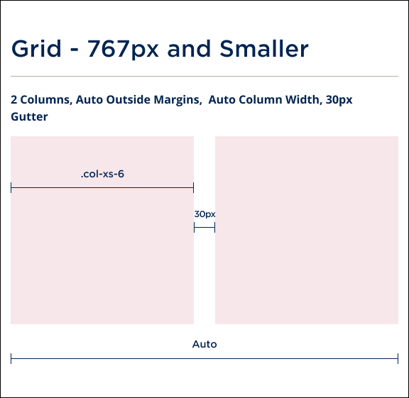
Grid should never break down by more than 2 columns. (Bootstrap class .col-xs-6)

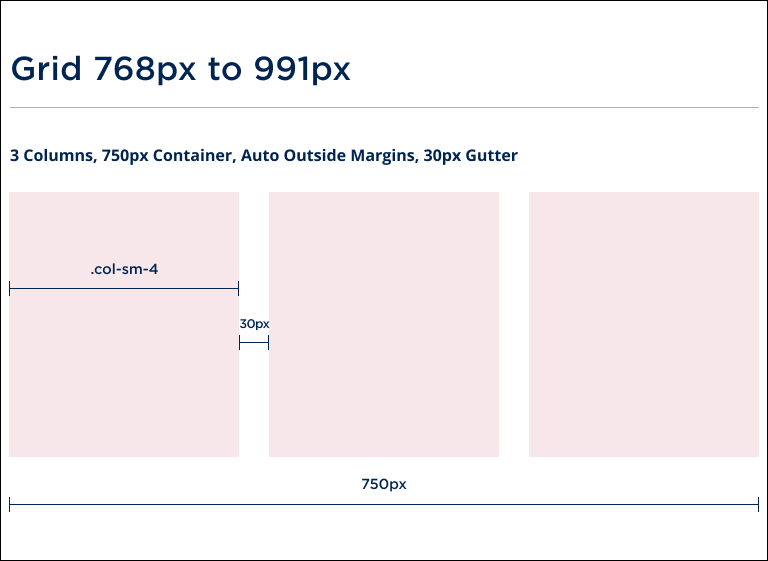
Grid should never break down by more than 3 columns.(Bootstrap class .col-sm-4)

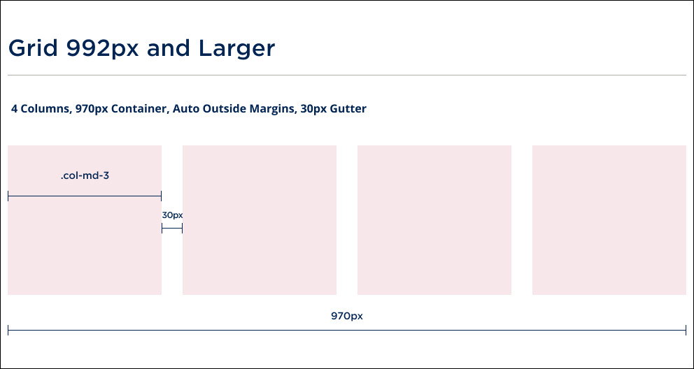
Grid should never break down by more than 4 columns. (Bootstrap class .col-md-3)

Colours and buttons
For reference, you can download a CSS version of the Queen's approved digital colours in scss format, with button and link styles included