View the example page to see this paragraph in action.
Guidelines for using this paragraph
- This block is always used at 100% width of the browser window.
- If you use 2 of these blocks in succession, be sure to stagger the content by selecting the “flip” option.
- Consider using the same background colour on every instance of this block for a better visual effect on mobile.
- The best way to prepare content is to write great titles, description and Calls to Action for your text links.
- Select an image that looks good alongside the background colour you’ve selected and vice-versa.
- Spotlighting content on top level pages like the homepage and main navigation pages.
- Short profiles of limited number of services or resources.
The only visible change that happens is that each section will stack and each column will be the full width of the device viewport.
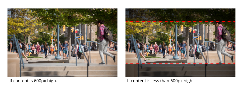
Images in this section will be resized horizontally to fit half the width of the browser window. It is recommended that images be no less than 960px wide and 600px high. Image will center both horizontally and vertically and will crop vertically based on the height of the content beside it. You may get some cropping on the top and bottom of the image. Keep your focal point centered in your image vertically to ensure that it will always be displayed.
Example:

How to use this paragraph
- Create a Basic Page
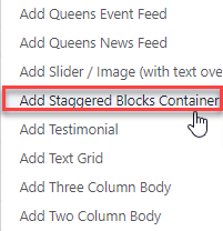
- Scroll down to the Paragraphs section and click "Add Staggered Blocks Container."

- When the paragraph loads, you will be at the bottom. Scroll back up to the top of the Paragraphs section.
- Review the Start Reversed setting to determine if it's right for you.
- Proceed to the Tiles section of this guide below.
- Once you've added as many tiles as you want, choose your publishing options and click "Save" at the bottom of the page.
Tiles
Each text/image combo is referred to as a tile. You add content to each tile and tiles to the Staggered Blocks container to create the alternating cascade of images and text that is known as a Staggered Block Paragraph.
Overview of a tile

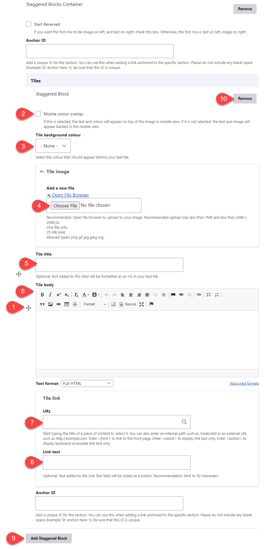
- Click and drag the crosshairs handle to rearrange your tiles' order.
- Mobile Colour Overlay - overlays the tile background colour onto the image with text on top when in mobile view.
- Tile Background Colour - options for the background colour of the text portion of the tile. There are 4 options: none, white, blue and grey.
- Tile image - upload the image for your tile. It's recommended you use the file browser rather than uploading your images directly to the tile. This way you can easily reuse images across your site.
- (Optional) Tile Title - the title for your tile's text.
- (Optional) Tile Body - the body text for your tile.
- (Optional) URL - a link at the bottom of your tile's text.
- (Optional) Link text - the text of the link at the bottom of your tile's text.
- Add Staggered Block - add a new tile. The image and text will be automatically reversed in order to the previous tile.
- Remove - remove this tile.