View the example page to see this paragraph in action.
Guidelines for using this paragraph
- This block is always used at 100% width of the page container (not the browser window).
- The height of all the cards will stretch to fit the card with the most content (bottoms will all align).
The best way to prepare content is to write great titles, description and Calls to Action for your text links.
The only visible change that happens is that each section will stack and each column will be the full
width of the device viewport except for some padding on the sides.
How to use this paragraph
- Create a Basic Page.
- Scroll down to the Paragraphs section, click the drop-down arrow, and click "Add Card Column (No Image) Container."
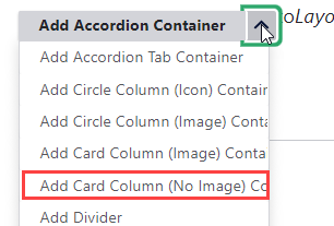
- Proceed to the Overview of a Column Card (No Image) Container section of this guide below.
- Once you've added up to 4 cards, choose your publishing options and click "Save" at the bottom of the page.
Overview of a Column Card (No Image) Container
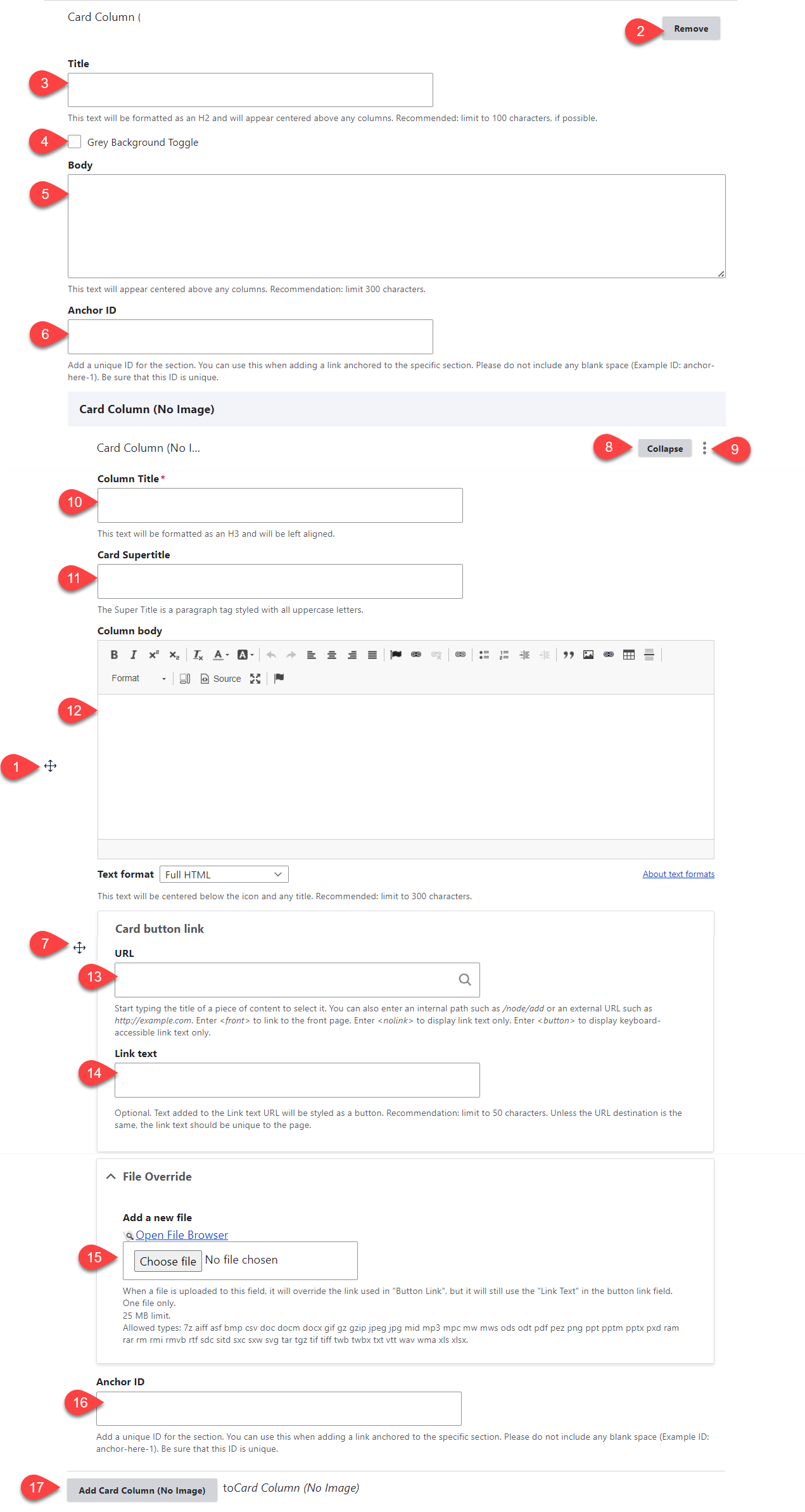
- Click and drag the crosshairs handle to rearrange your paragraphs.
- Remove the Column Card (No Image) paragraph.
- (Optional) Title - this is the title for the Column Card (No Image) paragraph. It appears above the cards.
- Grey Background Toggle - if this option is unchecked, the divider will appear on a white background. If it is checked, it will appear with a grey background. Only use the grey background if you are adding a divider between two paragraphs that also use a grey background.
- (Optional) Body - this is the body for the Column Card (No Image) paragraph. It appears above the cards.
- (Optional) Anchor ID - add a unique ID if you'd like to link to this specific section of the paragraph from another location
- Click and drag the crosshairs to rearrange your carfds within the Column Card (No Image) paragraph.
- Collapse this specific card.
- Remove the individual card.
- Column Title - this title appears at the top of the card.
- Card Supertitle - this title appears below the title.
- (Optional) Column body - this content appears below the titles.
- (Optional) URL - this link appears below the image. If you will be uploading a file, enter <nolink> in this field - it will be overridden when you select your file in the File Override field.
- (Optional) Link text - this is the text for the link that appears below the image.
- (Optional) File Override - add a file if you would like the link set to link to a file instead of a URL
- You can either upload a file directory to the page, or open the file browser to upload the file to the site's central file repository. It is recommended that you open the file browser to upload, so that you can reuse the image in the future.
- If you are opting to use the File Override, you'll still need to fill in the URL field - we recommend adding <nolink>
- (Optional) Anchor ID - add a unique ID if you'd like to link to this specific card of the paragraph from another location
- Add Column Card (No Image) - this adds another card. There are no limits on the number of cards you can add. Cards will automatically stack in rows of up to 3 cards per row.