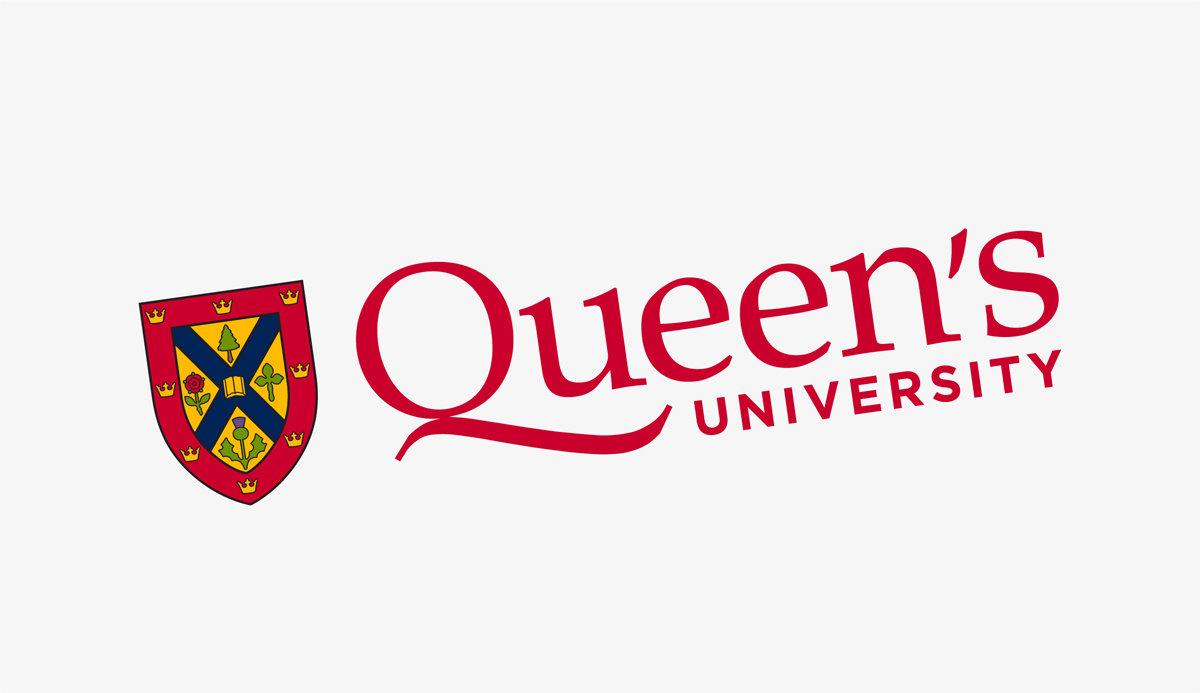
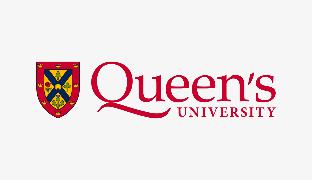
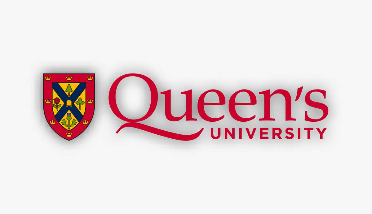
The Queen’s University logo is the official visual representation of the university and is available in a variety of formats appropriate for different uses. It has been simplified to improve legibility and accessibility in a digital environment.
The Queen’s logo consists of two elements – the shield and the wordmark. The updated shield is a simplified version of the official university coat of arms, which remains in use in some ceremonial applications. The updated wordmark features increased letter spacing in “Queen’s,” a heavier weight sans serif typeface for “University” and an adjusted swash Q for better alignment.
Logo Resources
The updated Queen’s logo is available for download in horizontal and vertical orientations and in a variety of file formats for print and digital applications. Always use the logo files as provided.
Visual Identity Guide
The Visual Identity Guide outlines the elements that create the Queen's brand style, as well as the full set of guidelines for the correct and consistent application of the visual identity. It is recommended to view the online PDF to ensure that you are referencing the most up-to-date version.
Logo Orientations
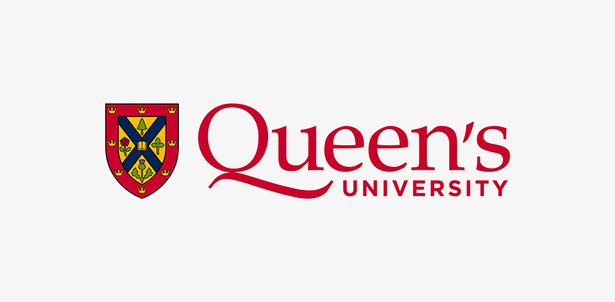
Horizontal Logo
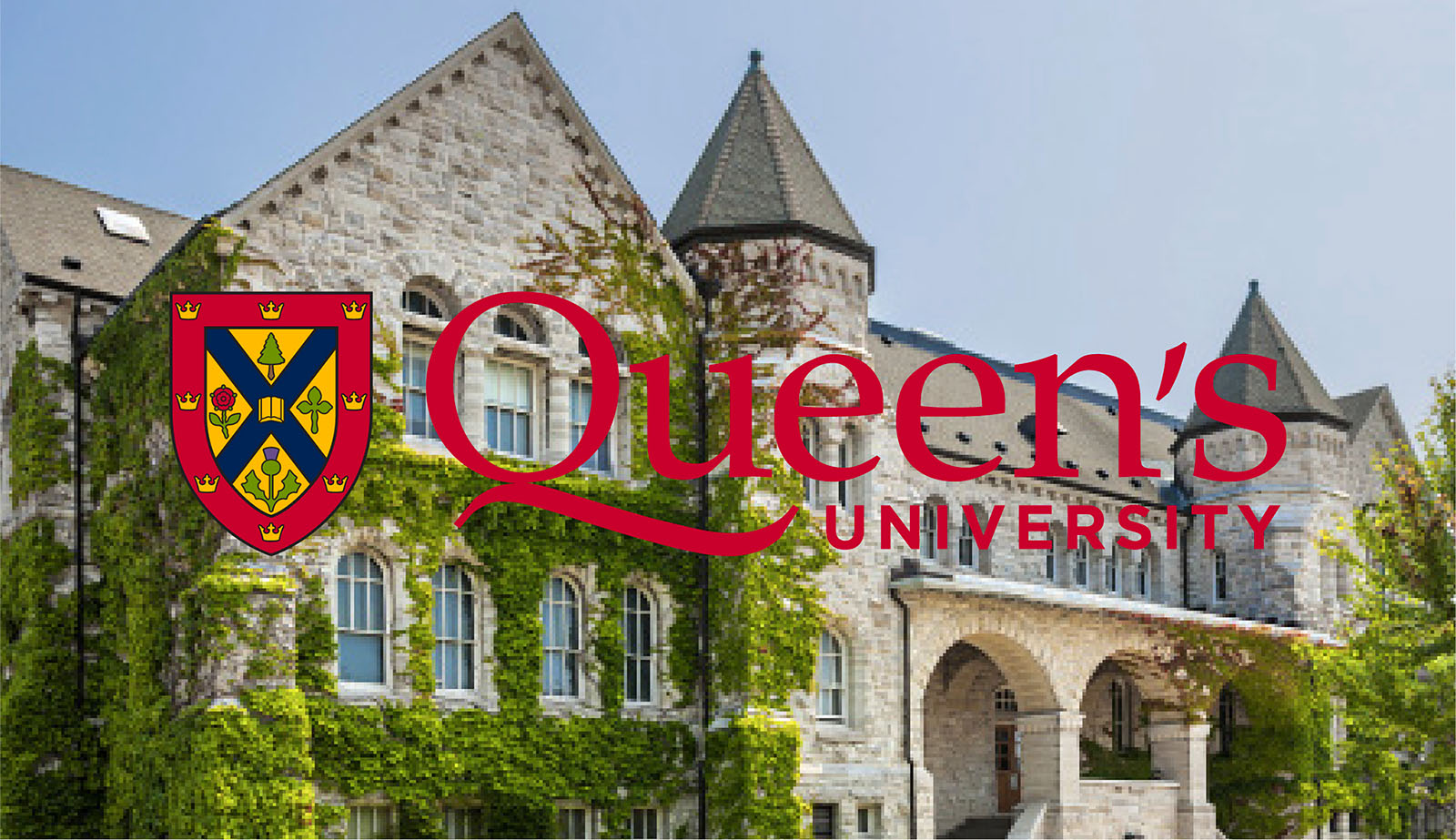
The horizontal orientation of the Queen’s University logo is recommended for applications with a left or right justification. It is the preferred version for digital environments and works well in horizontal applications such as website banners.
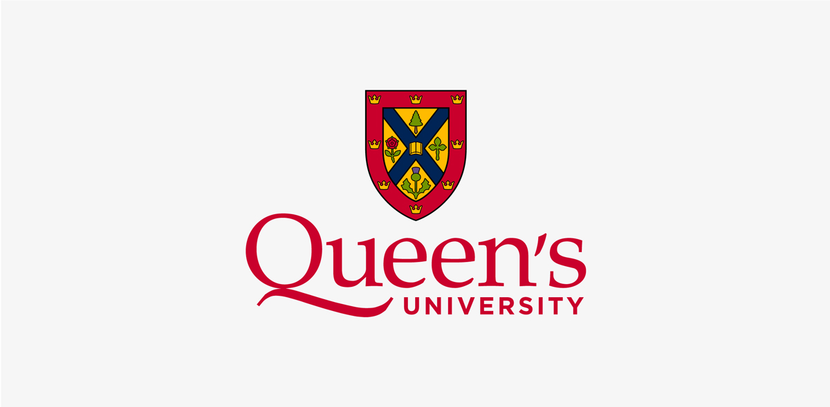
Vertical Logo
The vertical orientation of the Queen’s University logo is recommended for applications with a centred alignment and for more formal and ceremonial applications like certificates and awards. It is also a good choice when a larger shield is required such as on merchandise.
Clear Space and Minimum Size
Clear Space
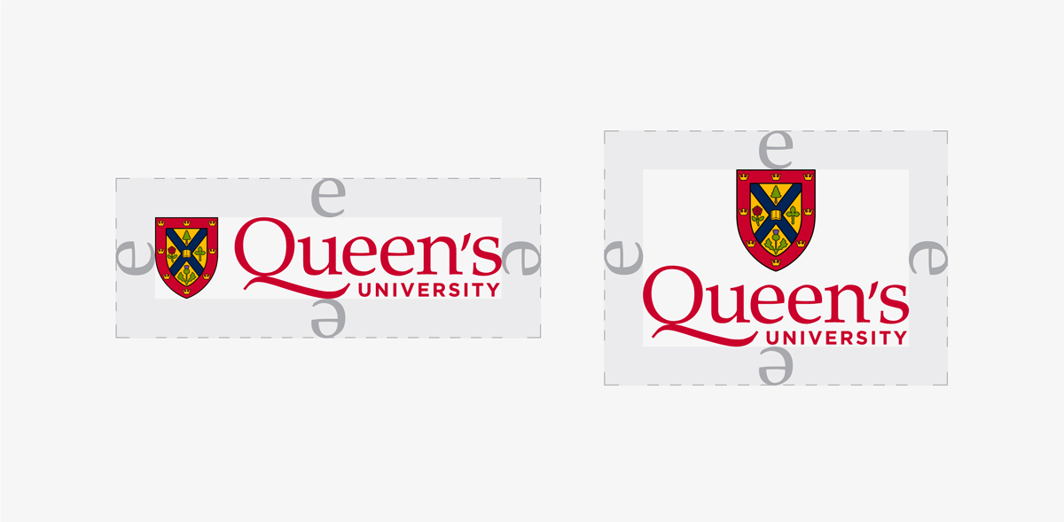
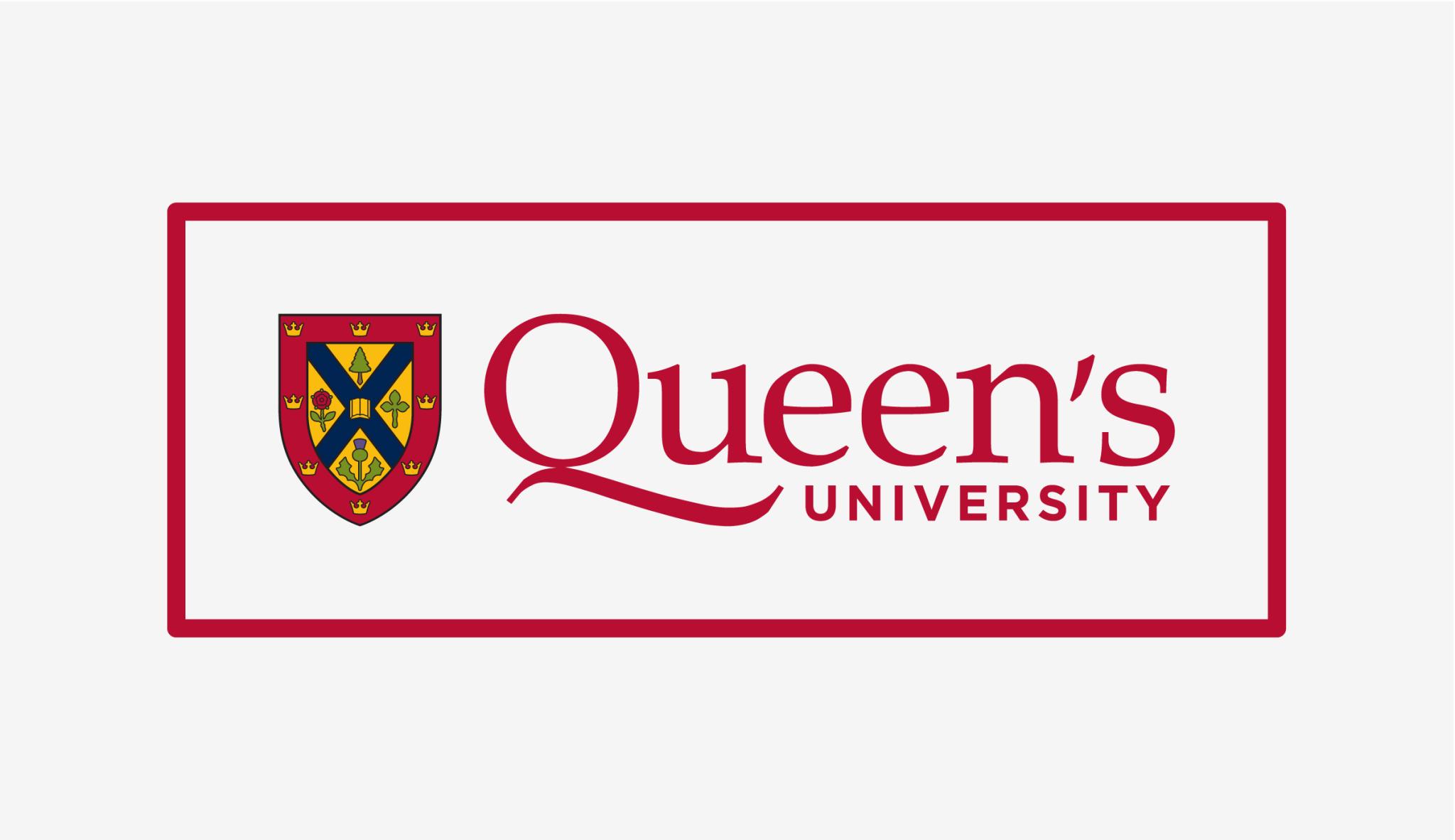
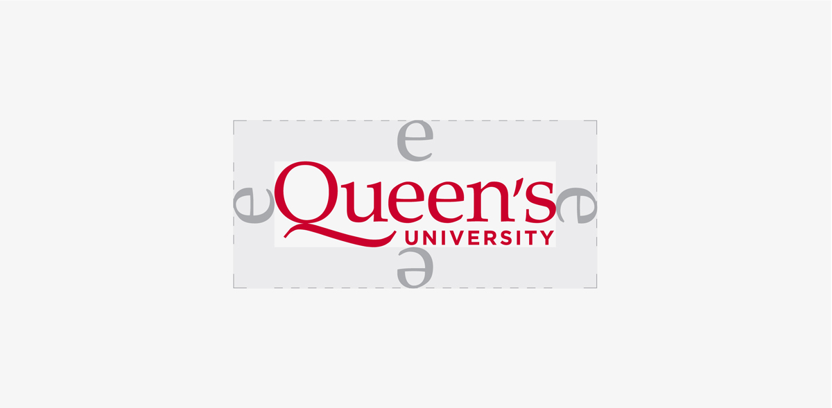
A minimum clear space must be maintained around the Queen’s logo at all times in order to preserve its impact and integrity. The clear space for the logo is defined by the height of the lowercase “e” in the word Queen’s, extending from the furthest edges of the logo on the top, bottom, and sides. No other type or graphic element may appear within the prescribed clear space, including the edge of an application.
Minimum Size
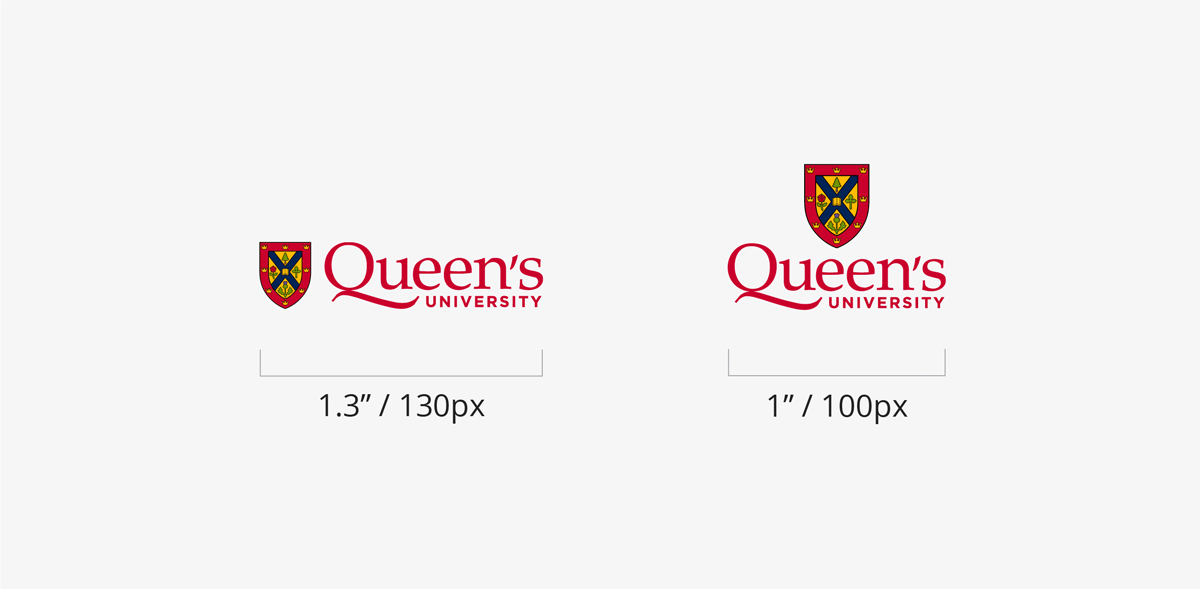
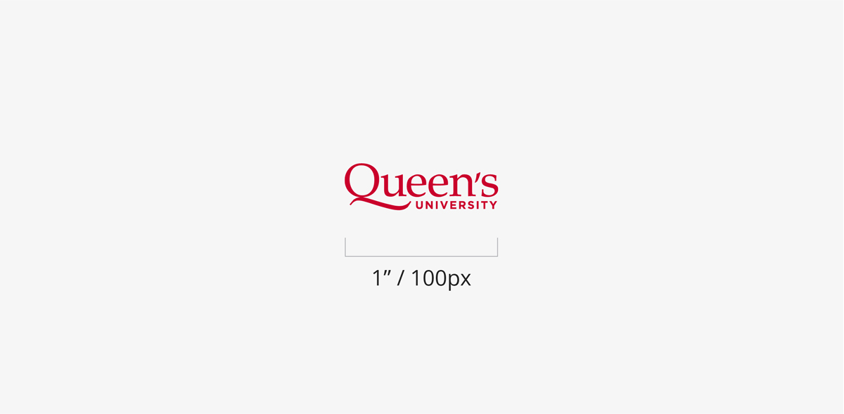
The recommended minimum sizes have been established to maintain the legibility of the Queen’s logo. The horizontal logo should be no smaller than 1.3” or 130 pixels wide. The vertical logo should be no smaller than 1” or 100 pixels wide.
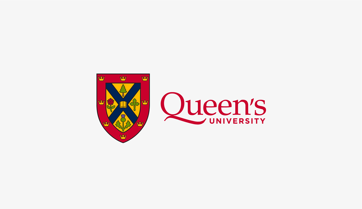
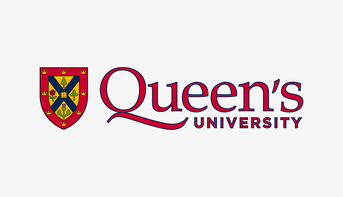
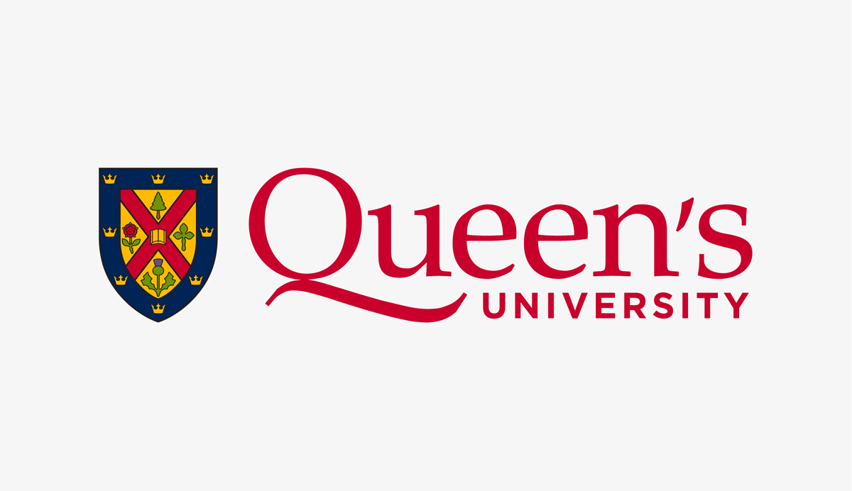
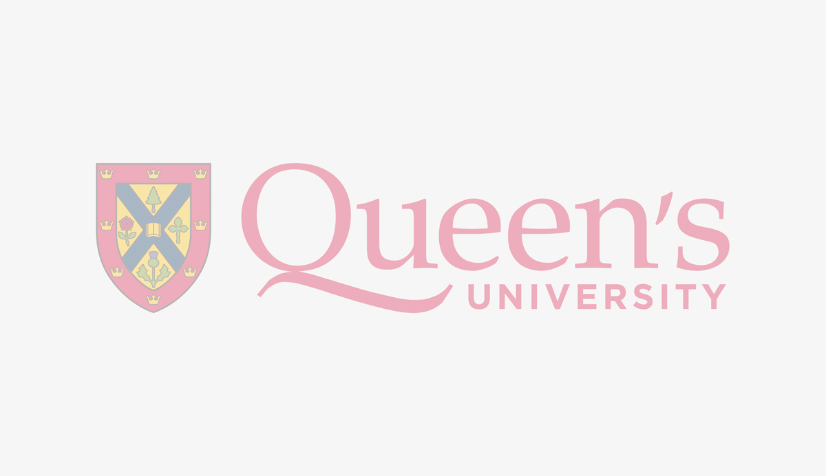
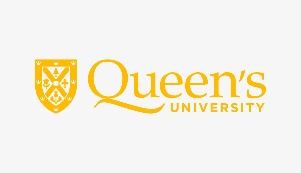
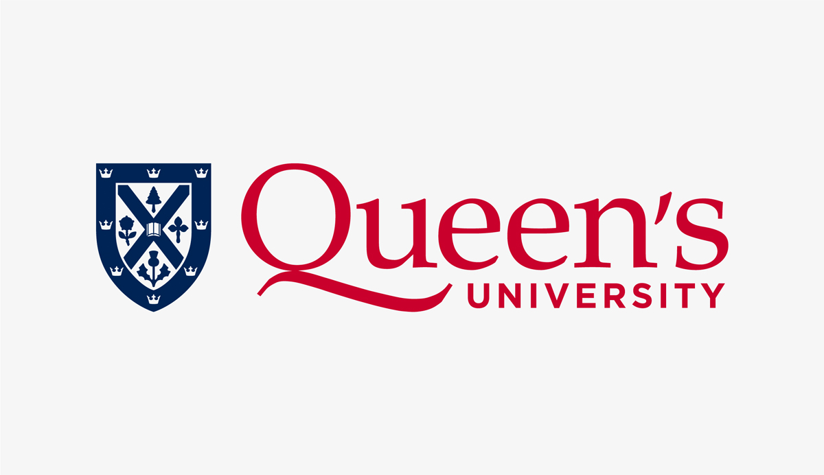
Logo Colour Versions
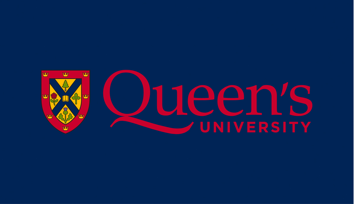
There are several colour versions of the Queen’s logo available in both horizontal and vertical formats. The full colour and full colour reverse logos should be used whenever possible. Three one-colour variations have been created to provide flexibility for one or two-colour applications. The one-colour logo is available in Queen’s Blue, black, and white.
For guidelines on the recommended and restricted background colours for each logo colour, view the full Visual Identity Guide.

Full Colour
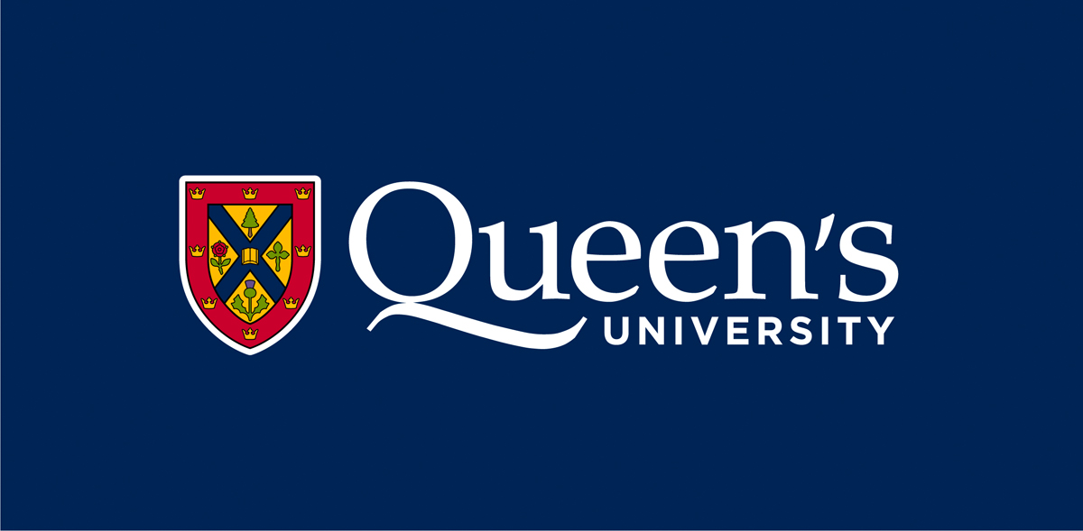
Full Colour Reverse
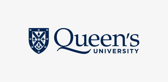
One Colour – Blue
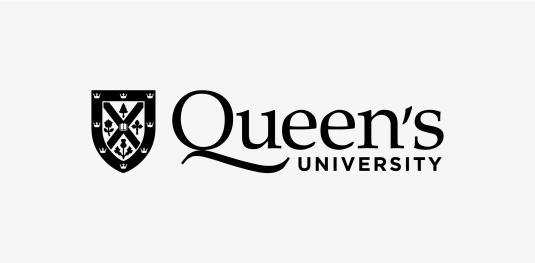
One Colour – Black
One Colour – White
Accessible Colour Contrast
When placing the Queen’s logo on a coloured background, ensure that the level of contrast between the logo and background comply with Accessibility for Ontarians with Disabilities Act (AODA) standards using a contrast checker tool. For additional information, visit the Queen’s Accessibility Hub.
Incorrect Logo Use
Logo Modifications
It is imperative that the integrity of the Queen’s logo be maintained at all times. It is our most important brand asset and cannot be altered in any way. It is not permitted to extract any part of the Queen’s logo, shield, or wordmark and use it in another logo, graphic, or design. Under the guidance and approval of the University Relations Brand Team there are two exceptions: The swash Q may at times be used as a large graphic element by faculties and departments, and the shield may be used alone in some instances, such as on merchandise.
The following are examples of how the logo cannot be modified or used. These parameters apply to all logo and lockup versions.
DO NOT alter the proportions of shield and wordmark
DO NOT rearrange or remove elements of the logo
DO NOT distort the logo
DO NOT rotate the logo from upright to any other angle
DO NOT change the fonts in the wordmark
DO NOT crop the logo
DO NOT enclose the logo in a shape
DO NOT add drop shadows or other effects to the logo
DO NOT outline the logo
DO NOT use the swash Q in another wordmark, logo, or graphic. Use as a graphic device must be approved by the Brand Team.
DO NOT use the shield as part of another design. Use of the shield alone must be approved by the Brand Team.
DO NOT add additional type or graphic elements to the logo or infringe on its clear space
Always use the logo files provided for download. Do not attempt to reset, alter, or build another configuration of the logo.
Colours and Backgrounds
The following are examples of how the logo cannot be modified or used in terms of colour or background. These parameters apply to all logo and lockup versions.
DO NOT place the logo on a background with low colour contrast
DO NOT place the logo on a detailed background or photo and always preserve clear space, even related to photographic elements. The logo cannot cross over multiple background colours.
DO NOT change the colour of the wordmark
DO NOT change the colour of the shield
DO NOT tint or change the opacity of the logo
DO NOT use the one-colour logo in a colour other than Queen’s Blue, black or white
DO NOT create a two-coloured logo
DO NOT change the full colour logo to grayscale
Always use the logo files provided for download. Do not attempt to reset, alter, or build another configuration of the logo.
Logo Placement
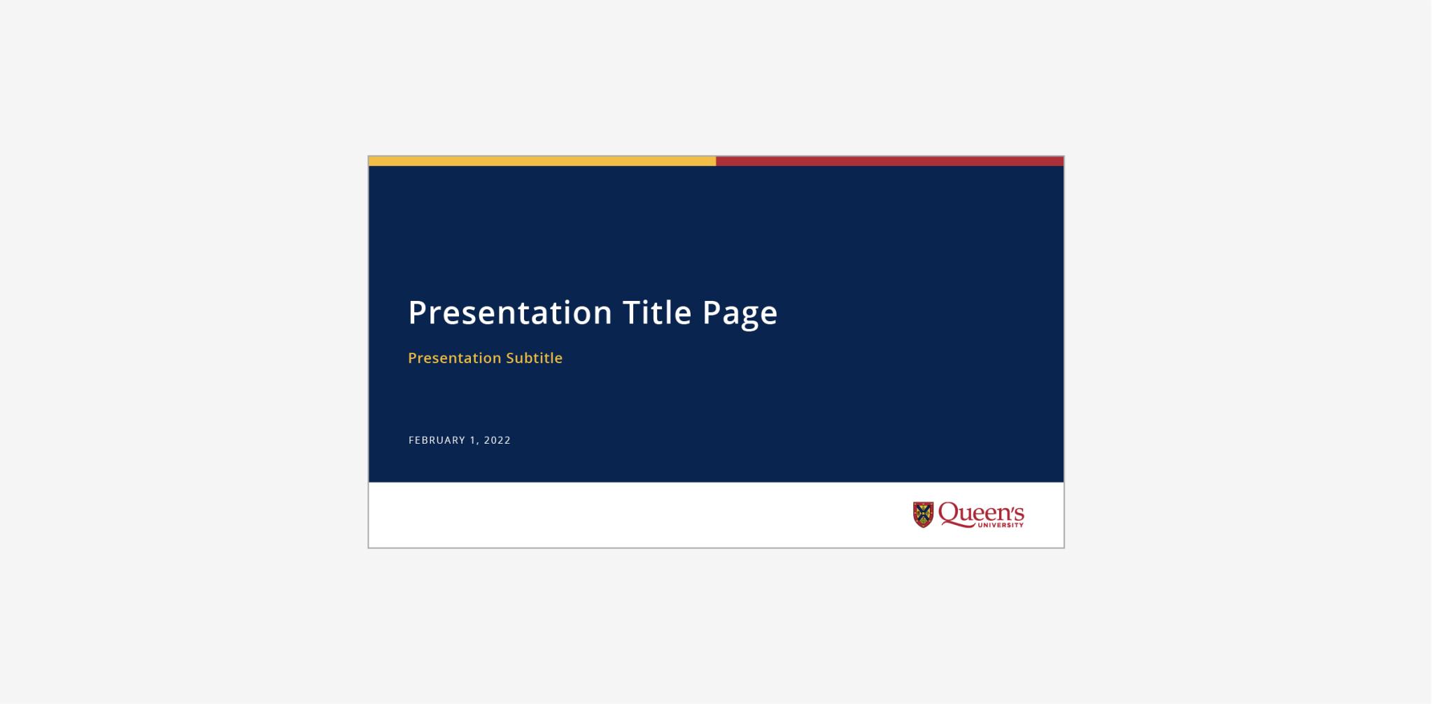
Horizontal Logo
The ideal placement for the horizontal logo is in one of the four corners of an application with left or right justified copy.
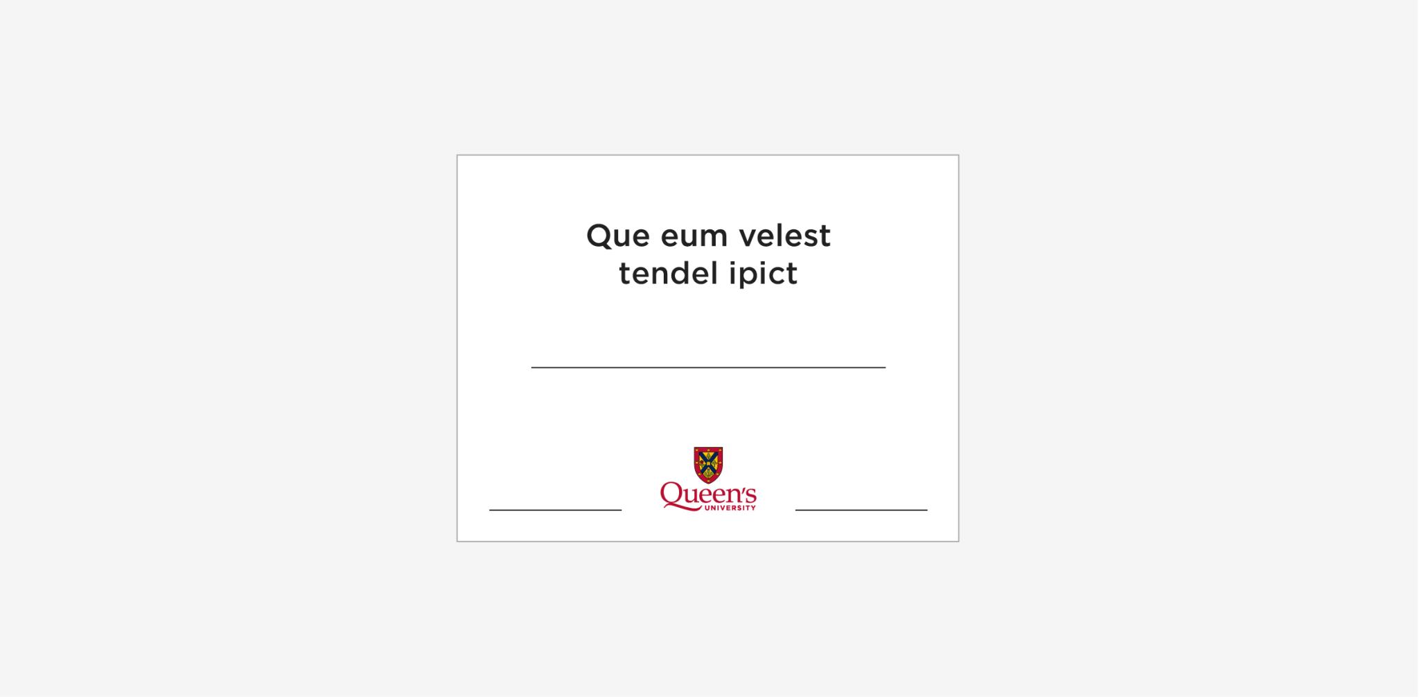
Vertical Logo
The ideal placement for the vertical logo is centred at the top, middle, or bottom of an application with centre-justified copy.
Logo size should be proportionate to the application size, used at a size that clearly brands the application but does not dominate the layout. The exception to this is on applications in which the logo is the primary focus (ie pole pennant, baseball hat).
Wordmark
The wordmark alone (without the shield) should be used sparingly, only for circumstances in which quality reproduction of the full Queen’s logo would not be possible due to size and/or printing process.
Wordmark Colour Versions
The wordmark can be used in Queen’s Red, Queen’s Blue, black, or white and the same background colour rules outlined for the full logo also apply to the wordmark.
Clear Space
The clear space for the wordmark is defined by the height of the lowercase “e” in the word Queen’s, extending from the furthest edges of the wordmark on the top, bottom, and sides.
Minimum Size
To maintain the legibility of the Queen’s wordmark, it should be no less than 1” or 100 pixels wide.
Shield
The shield in the Queen’s logo is a simplified version of the Coat of Arms. The motto banner has been removed and the graphics simplified for improved legibility in a digital environment. The shield is approved for use as a social media profile picture. Please use the profile picture files provided for download.
The shield can be used alone in limited applications approved by the University Relations Brand Team.
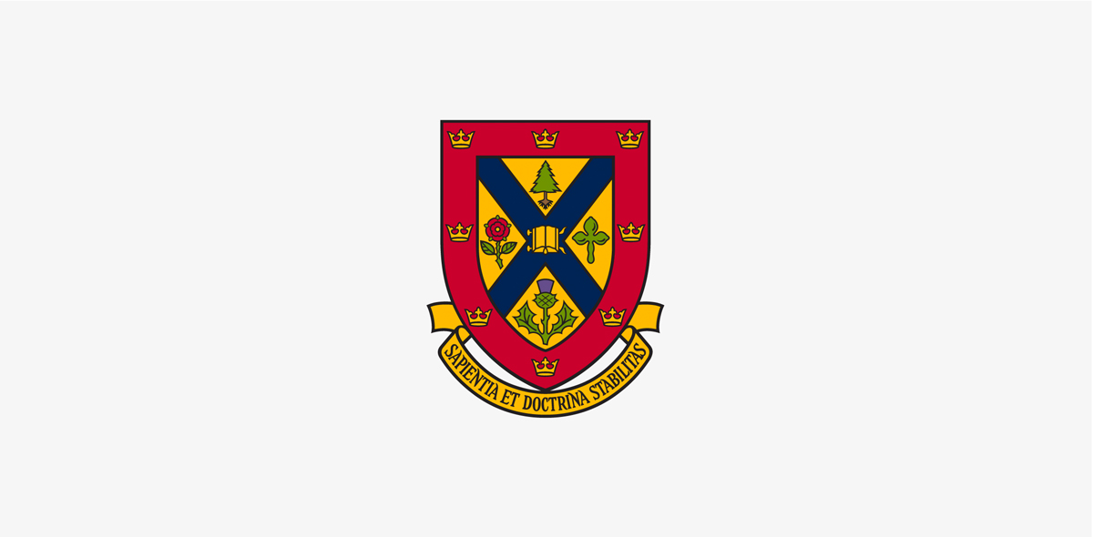
Coat of Arms
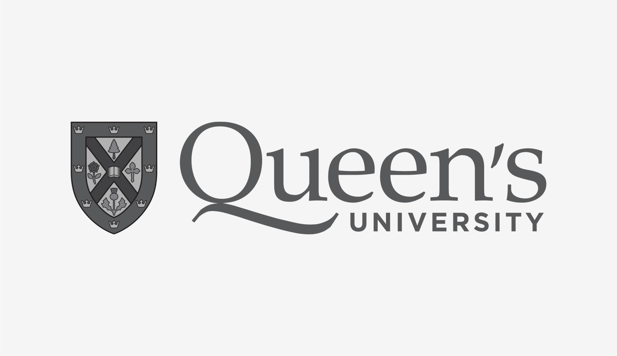
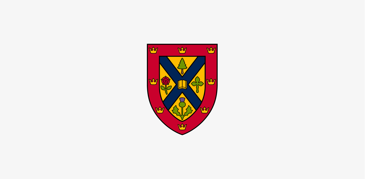
The Queen’s Coat of Arms consists of a gold shield with red edges, divided into four triangular compartments by a blue, diagonal cross. A golden book, symbolizing learning, sits open at the centre of the cross surrounded by a pine tree, a clover, a thistle, and a rose. The border is decorated with eight gold crowns and underlined by a banner with the Queen’s motto: Sapientia et Doctrina Stabilitas (Wisdom and knowledge shall be the stability of thy times).
The use of the Coat of Arms is reserved for limited formal and ceremonial applications, such as awards and certificates. It should not be used in place of the Queen’s logo or on external-facing communications.
If you have an application requiring the use of the simplified shield or coat of arms, please contact the University Relations Brand Team for approval.