
Typography is an important element of effective and accessible university communications. Consistent application of typography is key to maintaining the Queen’s brand style.
Fonts
The Queen’s University fonts support our digital-first approach and help ensure accessibility. Gotham ScreenSmart and Open Sans are our two sans serif typefaces and Volkhov is our serif typeface. To preserve the uniqueness of the Queen’s logo, do not use Palatino, the serif font used in the Queen’s wordmark.
Gotham ScreenSmart – Titles, headings, subheadings, URLs, and small amounts of copy in designed applications (brochures, advertising, etc.)
Open Sans – All levels of typographic hierarchy in websites and business applications (Powerpoint, Word), and body copy in designed applications (brochures, advertising, etc.)
Volkhov – Titles and headings, to convey a different tone and personality in designed applications (brochures, advertising, etc.)
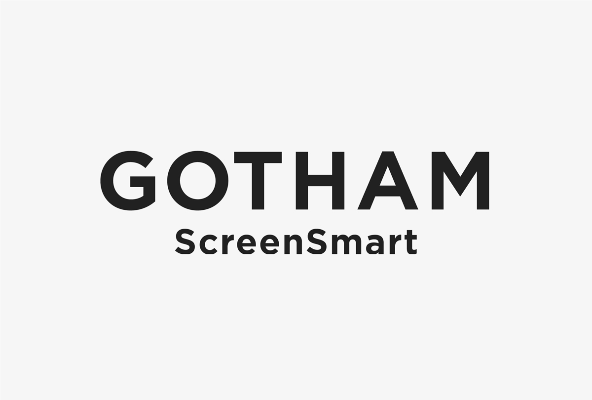
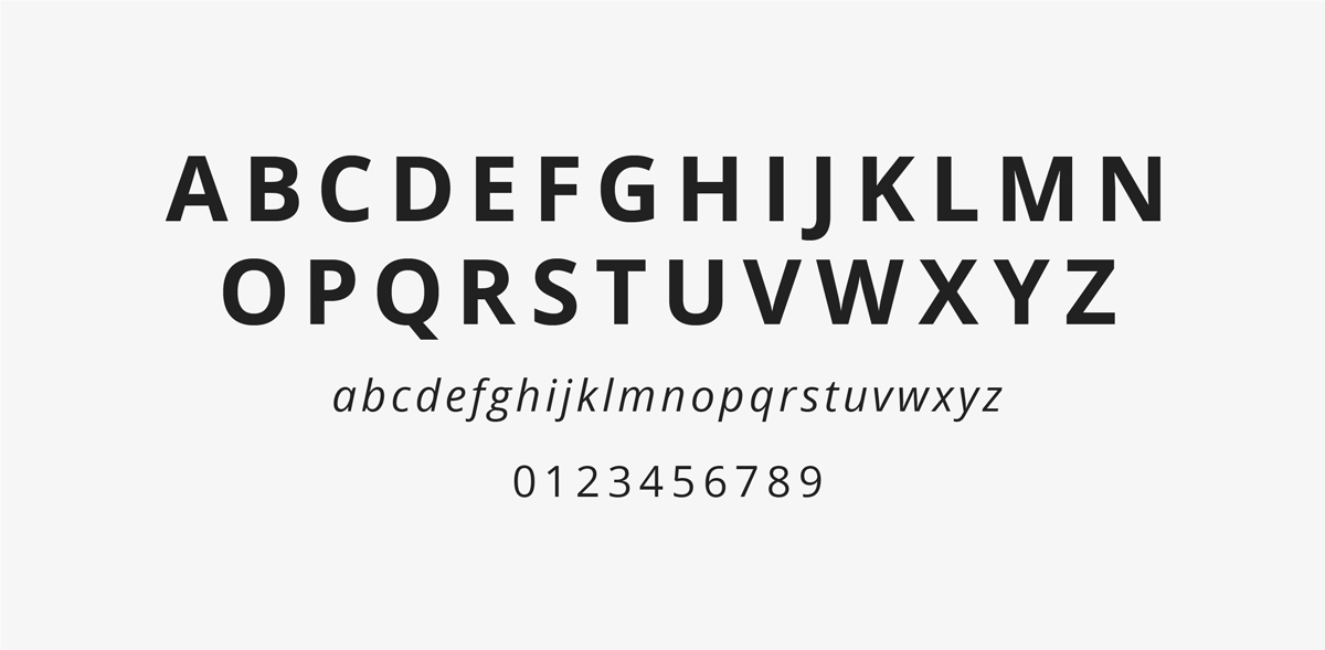
Gotham ScreenSmart
Gotham ScreenSmart is one of our sans serif brand fonts and has been adapted for legibility in digital applications. Gotham is the primary title font for designed applications, like brochures and advertising. It is also recommended for headings, subheadings, intro paragraphs, quotes, and URLs in those applications.
While Gotham works very well in all caps, capitalization should only be used for purposeful differentiation or emphasis to retain maximum accessibility. Avoid using all caps for any text longer than a few words.
Black weight should only be used for small amounts of text, like an individual word or character, and at a larger size. Medium and Bold weights are easier to read and more accessible for emphasized text like headings.
Gotham ScreenSmart is available in the following recommended weights and styles: Book, Book Italic, Medium, Medium Italic, Bold, Bold Italic, Black, and Black Italic.
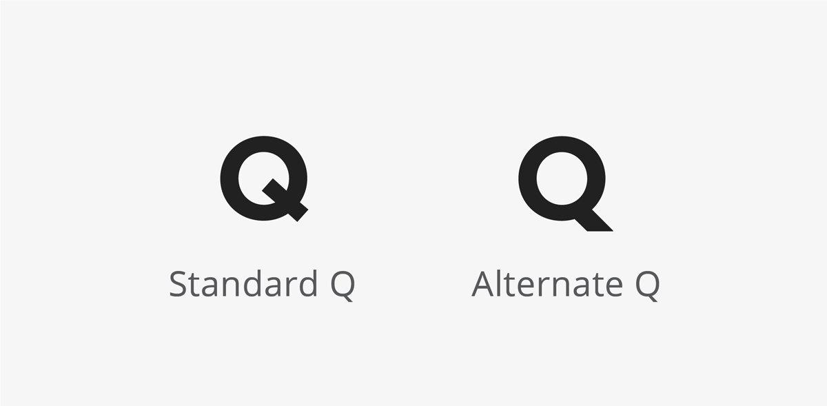
Gotham provides a standard Q with a cross stroke and an alternate Q with the stroke extending from the bottom of the round. Please use the alternate Q for titles, headings, and subheadings.
Those responsible for designing marketing and communications may contact the University Relations Brand Team to obtain a license for Gotham ScreenSmart. The license is for an individual computer. Open Sans is the recommended sans serif font for other applications.
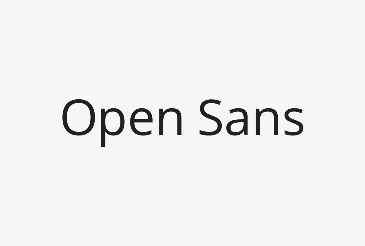
Open Sans
Open Sans is a sans serif typeface and our preferred digital font. It is optimized for print, web, and mobile interfaces. Open Sans is the primary font for websites, presentations, and other business applications, and the body copy font for designed applications like brochures and advertising. It is also recommended for small type, such as captions and footnotes.
Extrabold weight should only be used for small amounts of text, like an individual word or character, and at a larger size. Semibold and Bold weights are easier to read and more accessible for emphasized text like headings.
Open Sans will be the font used most widely by the Queen’s community.
Open Sans is a free Google font available for immediate download.
Open Sans is available in the following recommended weights and styles: Regular, Regular Italic, Semibold, Semibold Italic, Bold, Bold Italic, Extrabold, and Extrabold Italic.
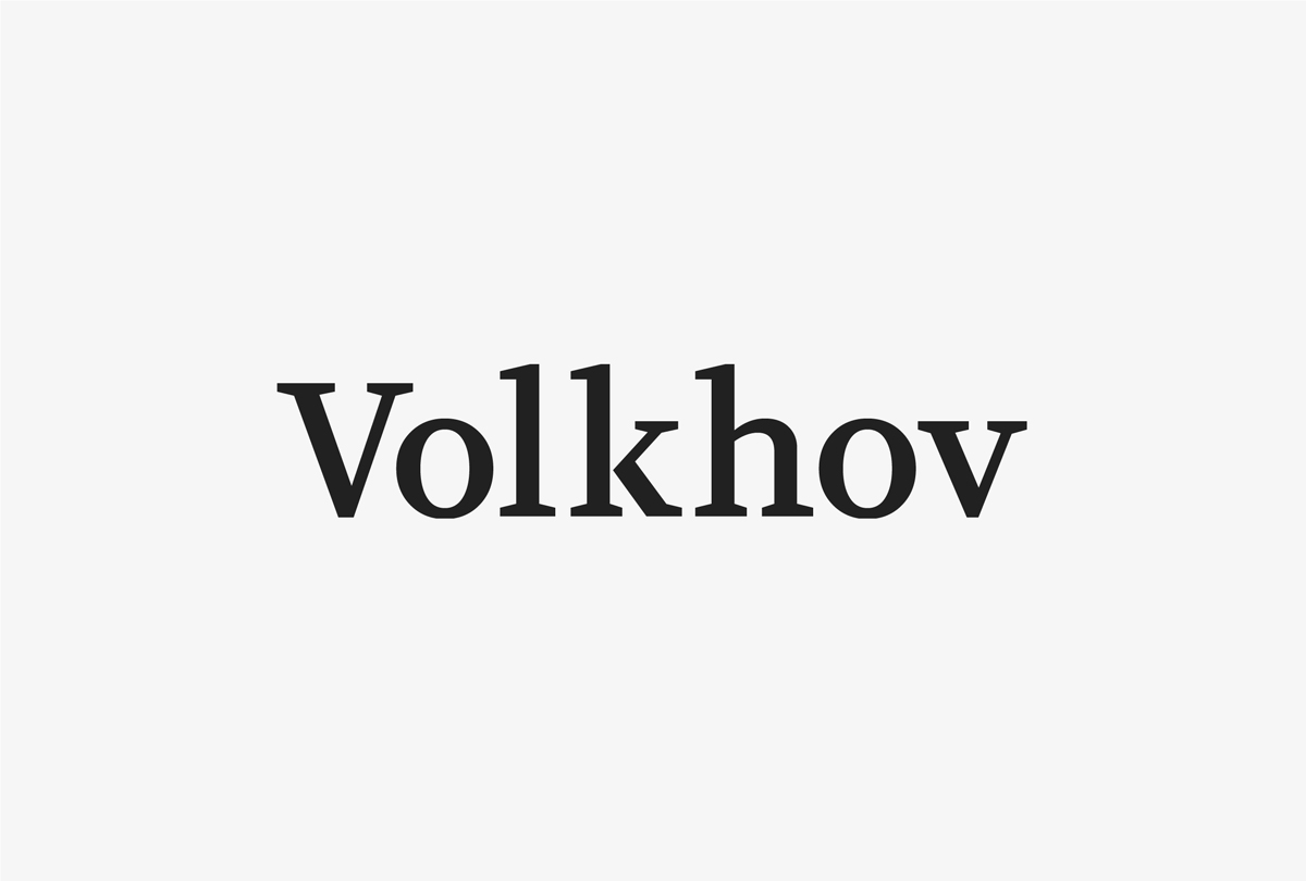
Volkhov
Volkhov is our serif brand font. It is an alternate title and heading font which provides brand users with the flexibility to give a different character to or create emphasis in designed applications, like brochures and advertising.
Volkhov is a free Google font available for immediate download.
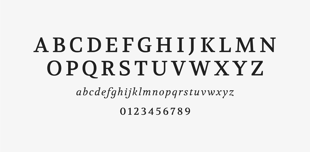
Volkhov is available in the following recommended weights and styles: Regular, Regular Italic, Bold, and Bold Italic.
Font Use
Effective typography that integrates contrasting weights and textures creates interest and helps readers navigate the material.
Title and Heading Case
Long, editorial titles, headings, and subheadings are best set in sentence case. Short titles, headings, and subheadings are best set in title case. Consistency across an application must also be a consideration when choosing case.
Minimum Type Size
To maximize legibility in print applications, the recommended point size for body copy is 10 point.
Print Examples
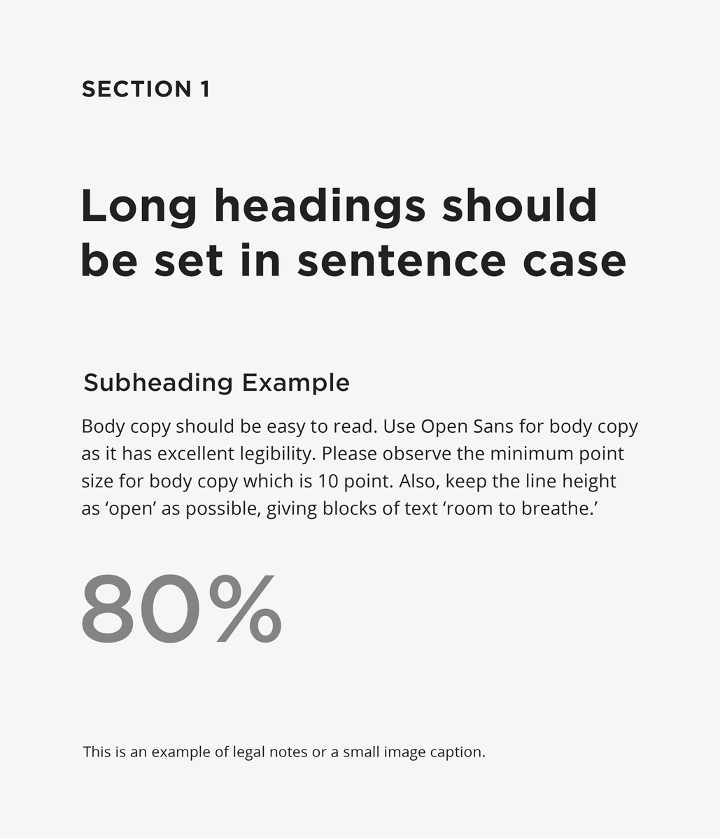
Section header
Gotham SSm Bold
Size: 12 pt
Tracking: 40
Heading
Gotham SSm Bold
Size: 24 pt, Line height: 30,
Tracking: 10
Subheading
Gotham SSm Medium
Size: 13 pt, Line height: 17
Tracking: 10
Body copy
Open Sans Regular
Size: 10 pt, Line height: 15
Tracking: 10
Infographic
Open Sans Medium
Size: 50 pt
Tracking: 0
Caption
Open Sans Regular
Size: 8 pt, Line height: 10
Tracking: 15

Section header
Gotham SSm Bold
Size: 12 pt
Tracking: 40
Heading
Volkhov Regular
Size: 26 pt, Line height: 32
Tracking: 20
Subheading
Gotham SSm Medium
Size: 13 pt, Line height: 17
Tracking: 10
Body copy
Open Sans Regular
Size: 10 pt, Line height: 15
Tracking: 10
Infographic
Open Sans Medium
Size: 50 pt
Tracking: 0
Caption
Open Sans Regular
Size: 8 pt, Line height: 10
Tracking: 15
Digital Font Use
WebPublish3 templates have been created to provide consistency across all Queen’s University websites. Fonts, sizes, and spacing are preset within the templates. These templates are continuously updated to reflect Queen’s Visual Identity guidelines and provide additional features. Visit WebPublish Service and Support to view the existing templates. Web guidelines will be developed and provided for additional direction in the future.