Human Rights & Equity Office
Creating Accessible Emails using MS Outlook (Win/Mac)
Email is one of the most important forms of communication to many of us in the Queen’s community. Email is fast, efficient, and creates a record of the communication. Like documents, accessible email communications ensures that they are usable by the widest range of users. This is important because, perhaps unknown to you, an email recipient may be a person with a disability who uses assistive technology such as a screen reader which reads aloud information on the screen such as text or image descriptions provided through alternative text (Alt Text).
Which Format to Use?
When composing a new email message, there are 3 formats to choose from:
- Plain text email will suffice for most small, routine correspondence. The advantages of plain text are that it can be read by any email program, is compatible with all email systems, and is compatible with all assistive technologies. Limitations of plain text are that you cannot apply document structure and the links are limited to full URLs.
- Rich text allows you to add formatting to your text. You can make text bold, add underlines, and insert links. Rich text does not allow you to add “semantic structure,” such as headings, which helps those using assistive technology screen readers in handling long, complicated documents. If you create a heading using bold text, a screen reader user will not know that the text is meant to be a heading. Also, rich text is not displayed the same in all email applications.
- HTML email is a good choice when you wish to add more formatting and structure to a message. HTML supports semantic headings, images with alternative text, links, and lists. When your emails contain any of these features, HTML is the format to use.
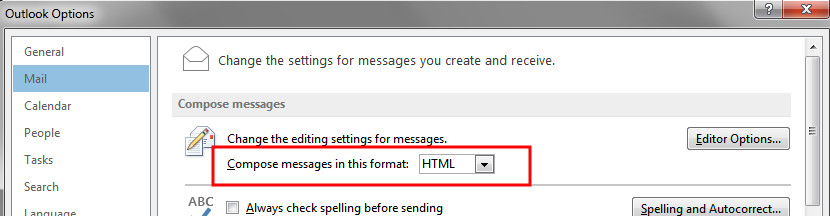
Since HTML supports semantic headings, images with alternative text, links, and lists it is the best format for ensuring the creation of accessible emails. Set HTML as the default email setting. Choose FILE >> OPTIONS, Under Compose messages, in the Compose messages in this format list, click HTML. Click OK to accept your changes, and close.
Font Style and Size
There is not a best typeface or font. Experts disagree on which typefaces provide the best readability.
- Use simple, familiar, and easily-parsed fonts.
- Avoid character complexity
- Avoid character ambiguity
- Use a limited number of typefaces, fonts, and font variations.
- Consider spacing and weight.
- Ensure sufficient, but not too much, contrast between the text and the background.
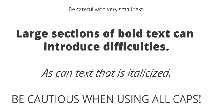
- Avoid small font sizes and other anti-patterns.
Fonts: Complexity & Ambiguity
Simpler shapes and patterns of typographical text are more quickly and accurately analyzed by the human mind. Be careful with complex fonts, especially for long sections of text.
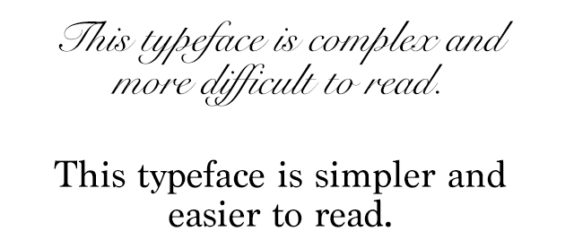
When glyphs or characters within a typeface appear similar to another, this can introduce ambiguity which must be processed by the brain, thus impacting reading speed and understanding.
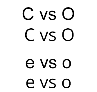
The texts above illustrate common ambiguities. The capital letters "C" and "O" and lowercase letters "e" and "o" in the Arial typeface look very similar due to the very narrow opening in the letters. This is contrasted with the wider opening and more distinct differences between "C" and "O" and "e" and "o" in the Open Sans typeface.
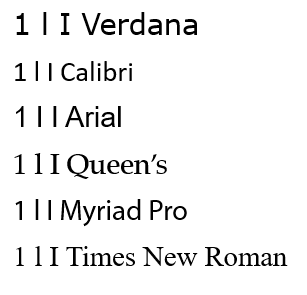
Similarly, capital "I", lowercase "l", and numeral "1" appear almost identical in some fonts, but are much more easily distinguished from each other in Verdana. Even though Verdana is a bit more complex, this minor complexity helps with disambiguation of characters.
Fonts: Size & Styles
- Avoid font sizes smaller than 10 pt.
- Use bold instead of italics or underlining text.
Source: WebAim Typefaces and Fonts
Appropriate Use of Colour
When using colour, you must make sure that any information conveyed with colour is also conveyed in black and white. For example, if you’re using colour to identify key words in a document, make sure that you also make them stand out in another way (for example, by putting them in bold).
Backgrounds
While Outlook gives the option of changing the color or even placing a picture behind text (e.g. stationary), it is recommended to keep the background white. Any shading in the background can make email difficult to read.
If a background color is included, please ensure that the contrast with the accompanied text is appropriate. List of Colour Contrast Testers.
Colour Contrast
You must provide high colour contrast to the text in your document. A good example of high colour contrast is black and white; while an example of poor colour contrast is light yellow and white.
Providing Structure
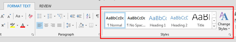
Styles are formatting instructions automatically programmed into most MS Office applications including Outlook. You can follow the guidelines for Creating Accessible Word Documents (Win/Mac).Styles are used in lieu of the buttons on the toolbar (for example, the “Bold” button, or the “Bullets” button). Use them to create:
- Titles (using the “Title” style)
- Headings (using one of nine “Heading” styles)
- Subtitles (using the “Subtitle” style)
- Bulleted Lists (using one of five different “List Bullet” styles)
- Numbered Lists (using one of five different “List Number” styles)
- Words in italics (using the “Emphasis” style)
- Words in bold (using the “Strong” style)
- Underlined words (using the “Subtle Reference” style)
Headings
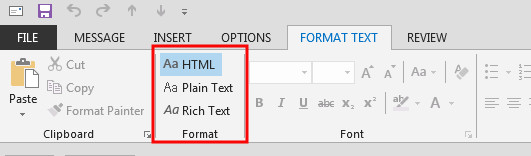
Headings are a type of Style which makes it easier for various adaptive technologies to navigate a document. Many people do not create Headings correctly, either making font sizes bigger or in bold rather than using the formats already provided by Outlook. By using Headings, you are creating a real structure in your document which will be correctly read by assistive technology and will make the page more usable for everyone. While composing an email you can access the Style section under the FORMAT TEXT tab.
Alternative Text
Any pictures, graphs or text boxes within a document must be given alternative text. Alternative text must give an accurate description of what the item is, so that the user’s assistive technology may convey what information is demonstrated by the item. It is a best practice to avoid using text boxes as they may be inaccessible by screen readers.
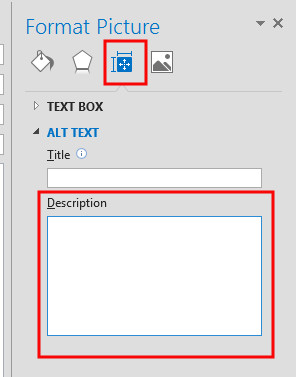
- Inset the image by choosing the INSERT tab
- Select the image and right click inside the image. A menu will appear.
- Select Format Picture. This open up the Format Picture panel on the right-hand side.
- Select the Layout and Properties button.
- Type the description in the area provided.
How to Create Good Alternate Text
- Consider the content and function of your image.
- If it provides content to your document, make sure that the information the image provides is described in the alt text.
- If your image only provides a function (for example, providing a portrait of a historical figure described in the text) you need only describe the image. In the case that the image is of a historical figure, write his/her name as the alt text.
- Try not to use “Image of...” or “Graphic of...” as alt text. That is usually evident to the person reading the alt text.
- Do not repeat the information which is contained in the document itself into the alt text. If it's already in the document, that should be enough.
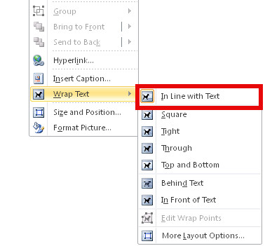
Wrapping Style of Non-Text Elements
To ensure the accessibility of non-text elements, the “wrapping style” should be set as In line with text.
- Select the image/text box and right click inside the image. A menu will appear.
- Select Wrap Text
- Select In line with text
Tables
Use the Microsoft tool to create tables. If you use the “Draw Table” tool, it will be difficult for your table to be read by assistive learning technology.
Inserting a Table
- Click on Insert in the toolbar.
- Select Tables.
- Select the number of columns and rows you want and click OK.
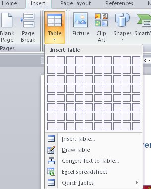
Table Headings
- Click anywhere in the table.
- Go to the Design tab at the top of the page.
- Check the Header Row check box.
- Type (or retype) your column headings.
- Press the Enter key.
Hyperlinks
To link your document to a website or another document, you may use hyperlinks. When doing so, make sure that the Hyperlink has context and describes where it leads. It should not just read “click here”, and should make it clear what the destination of the link is (example, the web link www.queensu.ca should be written as "Queen's University").
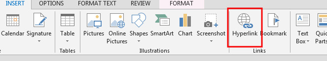
Inserting a Hyperlink in Outlook
- Highlight the text you wish to be the link.
- Click on Insert in the toolbar.
- Select Hyperlink from the Links box. A new window will pop up.
- You can hyperlink to a web site, place in this document, or an email address. Select the type of link you want, enter the information then select OK.
Signatures and vCards
Signatures in Outlook provide a way to add name and contact information to emails the same way every time without re-typing.
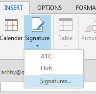
Steps for adding Signatures:
- Go to the INSERT tab, choose Signature, then Signatures
- Select New
- Give Signature a name, then click OK
- Type in Signature information, then click OK
Attachments
All email attachments need to be accessible. Making other documents accessible are covered by the Accessibility Hub “Tutorial" section. If for some reason you must send an inaccessible attachment, you must make sure that the body of your email includes all of the information that is included in the attachment.
Using MS Office’s Accessibility Checker
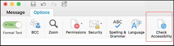
Outlook for Mac 2016 comes with a new accessibility checker that can aid in checking for problems in your document. This tool makes it easy to identify problems in your document, and explains what needs to be fixed.
Outlook for Mac
- Select Options
- Then Check Accessibility